Pictograph and Interpretation of a Pictograph
A pictograph is a way to represent data using images. Each image in the pictograph represents a certain number of things. In other words, a pictograph uses pictures and symbols to convey information about the provided data. Pictographs should be used very carefully and it is very comfortable to use, but sometimes they may lead to misinterpretation of data as well. Whenever pictographs are drawn, they should look visually correct as most of the times the data is interpreted visually. Different pictorial representation of data such as bar graph, line graph, pie charts and so on are available to easily interpret the data. In this article, let us discuss the definition of pictograph, how to make a pictograph, its advantages with many solved examples.
Table of Contents:
Pictograph Definition
The pictograph is a method to represent the data using images. Each image in the pictograph represents certain things. In other words, pictographs define the frequency of the data using images or symbols, which are relevant to the data. The pictograph is extremely easy to understand, and it is one of the simplest ways to represent the statistical data. In the pictograph, we use a key, which denotes the value of the symbol. While using symbols or images, all the symbols should be of the same size.
Advantages of Using Pictographs
Some of the important advantages of using Pictographs are as follows:
- Pictographs are used to express large information in a simple manner.
- It is easy to read, as all the information is provided at one glance.
- It does not require more explanation, as it is universally used.
- It attracts the attention of the viewers or readers, as it has many attractive images.
How to Make a Pictograph?
The different steps to make a pictograph are given below:
Step 1: Collect the Data
The first step in making a pictograph is the collection of relevant information, which we want to represent. Once the data is collected, make a table or a list of data.
Step 2: Select the Symbol or Images
To represent the data, pick any images/pictures or symbols. For example, if the data represents the rainfall for different cities, make use of cloud images or some other images which are relevant to the data.
Step 3: Assign a Key
While representing the data using images, use a key, which denotes the value of the image. Because, if the frequency of the data is too high, then one image is not enough to represent the data. Thus, the numerical value called “key” is used, which should be written along with the pictograph.
Step 4: Draw the Pictograph
While making a pictograph, use two columns that represent the category and data. Finally, draw the pictograph using symbols/images, which represents the frequency. In case, if the frequency is not a whole number, the symbols can be drawn as fractions.
Step 5: Review the Data and Pictograph
Once the pictograph is drawn, make sure that the images exactly represent data as well as the labelling of the pictograph.
Pictograph Examples
Let us consider an example, which will tell us how to interpret data using pictographs. In the given figure, the data of 100 students has been collected, who like different colours. The data given was as follows:

The data above can be represented as a pictograph as follows:

Where,

As we can see that the given data becomes more visually appealing and easy to interpret. Suppose, a question was asked, what is the difference between the students who like blue and red colours? By seeing the pictograph, we can directly interpret that there is a difference of 3 STUDENT and 1 STUDENT is equal to 5 students. So, the difference is of 15 students.
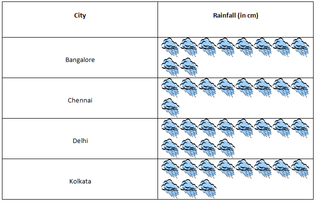
Consider another example in which the centimetre height of rainfall in different cities is given.

Let us draw a pictograph for the given data and try to interpret the given information.


Where each CLOUD represents 10 cm rainfall. Now, let us try to interpret some information from the above pictograph.
1. Which city had maximum rainfall as per the given data?
Delhi reported maximum rainfall, as the number of CLOUD is maximum for Delhi and since each CLOUD represents 10 cm rainfall, we have in total 12 CLOUD in Delhi, which means 120 cm of rainfall.
2. What is the sum of the total rainfall in all cities?
Total CLOUD in all cities are 42 and each CLOUD represents 10 cm of rainfall, so the sum total of rainfall in all cities is 420 cm.
Frequently Asked Questions on Pictograph
What is meant by Pictograph?
A pictograph is a way to represent the data using images or symbols. It represents the frequency of the data using images. Each image represents the frequency of the data.
What is meant by key in pictograph?
In a pictograph, a key represents the value of the image. If the frequency of the data is too large, a key is useful, which should be represented along with the pictograph.
Mention the different steps involved in making a Pictograph?
The steps involved in making pictographs are:
Collect the data
Select the image or symbol
Assign a key
Draw the pictograph
Review the data
What are the advantages of using pictographs?
It helps to express large information in a simple way.
It is easy to understand
It easily attracts the viewers as it uses attractive images
It does not require a lot of explanation
Mention the different names that represent pictographs?
Pictographs are also known as the pictorial chart, pictograph chart, picture chart, pictogram chart, etc.
To learn more about data handling please download BYJU’S-The Learning App and keep learning.