Control Charts
In Mathematics and statistics, we might have seen different types of charts and graphs. These are used to study the characteristics of the given data and to draw conclusions based on the data as per the requirements. In this article, you will learn about control charts and types of control charts for different types of data.
What are Control Charts?
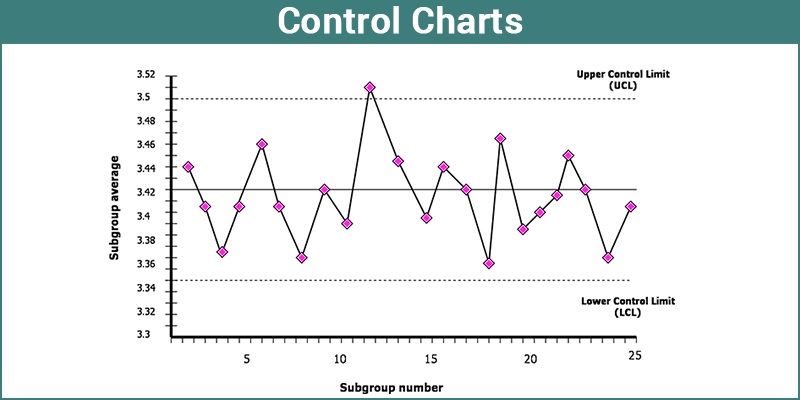
In statistics, Control charts are the tools in control processes to determine whether a manufacturing process or a business process is in a controlled statistical state. This chart is a graph which is used to study process changes over time. These charts are also known as Shewhart charts or process-behavior charts. The data is plotted in a timely order. It is bound to have a central line of average, an upper line of upper control limit and a lower line of lower control limit. Besides, the data obtained from the process can also be applied in making predictions of the future performances of the process.
When the analysis made by the control chart indicates that the process is currently under control, it reveals that the process is stable with the variations that come from sources familiar with the process. No changes or corrections are required to be made to the parameters of process control.

Types of Control Charts
After the basic chart is created, one can use various menus and options to make necessary changes that may be in a format, type or statistics of the chart.
To create a chart, it is not necessary to know the name or structure of any chart. You need to select the columns or variables that are to be charted and drag them in respective zones. When the data column is dragged to the workplace, the user starts working on it to create an accurate chart that is based on the data type and given sample size.
Control Charts for Variables
The control charts of variables can be classified based on the statistics of subgroup summary plotted on the chart.
- X¯ chart
- R Chart
- S Chart
X¯ chart describes the subset of averages or means, R chart displays the subgroup ranges, and S chart shows the subgroup standard deviations. Regarding the quality that is to be measured on a continuous scale, a particular analysis makes both the process mean and its variability apparent along with a mean chart that is aligned over its corresponding S- or R- chart.
Levey – Jennings Charts
This chart displays a mean process based on a long-term sigma with control limits. The control limits are placed such that the distance between them and the centerline is ‘3s’. The standard deviation value ‘s’ for these charts is determined by the same method as the standard deviation for the distribution platform.
Control Charts for Attributes
This type of data is usually continuous and based on the theoretical concept of continuous data. Count data is a different kind of data available which is also known as level counts of character data. The interesting variable is a unique count here for the number of blemishes or defects per subgroup. These attribute charts are appropriately applied for such discrete count data.
Pre-summarize Charts
The data can be combined into one measurement unit if the data you have, contains repetitive measurements of the same unit process. But this is not recommended until the data includes repeating measurements of every measurement process.
Typically, pre-summarize chart summarizes the process columns into standard deviations of sample means based on the size of the sample.
Features of Control Charts
A control chart consists of various attributes as listed below:
- Points represent a statistic of measurements of a quality characteristic in samples taken from the process of the data at different times. Here, the statistic can be a mean, range, proportion, etc.
- For all samples, the mean of this statistic is calculated. For example, the mean of the means, the mean of the ranges, the mean of the proportions.
- At the mean of the statistic, a centerline must be drawn.
- For all the samples, the standard deviation of the statistic is to be calculated.
- The natural process limits, i.e. upper and lower control limits (these are separate lines), indicate the origin at which the process output is considered statistically ‘unlikely’ and typically drawn at three standard deviations from the centerline. That means two standard deviations above and below the centerline.
To know more about Control charts and any other Mathematics related topics, visit BYJU’S and register with us.