
Frequency Polygons
A frequency polygon is almost identical to a histogram, which is used to compare sets of data or to display a cumulative frequency distribution. It uses a line graph to represent quantitative data.
Statistics deals with the collection of data and information for a particular purpose. The tabulation of each run for each ball in cricket gives the statistics of the game. Tables, graphs, pie-charts, bar graphs, histograms, polygons etc. are used to represent statistical data pictorially.
Frequency polygons are a visually substantial method of representing quantitative data and its frequencies. Let us discuss how to represent a frequency polygon.
Steps to Draw Frequency Polygon
To draw frequency polygons, first we need to draw histogram and then follow the below steps:
- Step 1- Choose the class interval and mark the values on the horizontal axes
- Step 2- Mark the mid value of each interval on the horizontal axes.
- Step 3- Mark the frequency of the class on the vertical axes.
- Step 4- Corresponding to the frequency of each class interval, mark a point at the height in the middle of the class interval
- Step 5- Connect these points using the line segment.
- Step 6- The obtained representation is a frequency polygon.
Let us consider an example to understand this in a better way.
Example
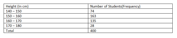
Example 1: In a batch of 400 students, the height of students is given in the following table. Represent it through a frequency polygon.
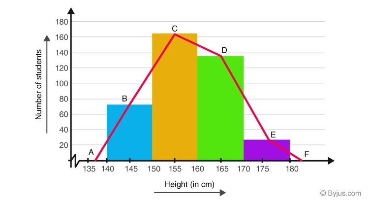
Solution: Following steps are to be followed to construct a histogram from the given data:
- The heights are represented on the horizontal axes on a suitable scale as shown.
- The number of students is represented on the vertical axes on a suitable scale as shown.
- Now rectangular bars of widths equal to the class- size and the length of the bars corresponding to a frequency of the class interval is drawn.
ABCDEF represents the given data graphically in form of frequency polygon as:
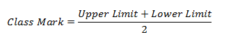
Frequency polygons can also be drawn independently without drawing histograms. For this, the midpoints of the class intervals known as class marks are used to plot the points.
To know more about different data collection methods, and statistics download BYJU’S –The Learning App.